Big data on small screens?
Designing an application for the modern mobile web
James Sconfitto, Exele
The computer is still young
Maybe I sound old saying this, but I remember a world before desktop computers were ubiquitous. When I was a kid, my dad had a Commodore 64 and an old IBM around the house, but I don’t think many of my friends had those. My conversations rarely centered around what was happening “online” unless it was about the absurd amounts of money getting thrown at “dot-coms”.1
By the time I was in college, things had changed. Everyone in the dorms had their own computer, many had laptops. Facebook was just beginning and chatting over IM was preferred to making a phone call (or texting).
It seems Bill Gates’ dream of a computer on every desktop has arrived, and when viewed in terms of the scale of human history, it appears to have happened fast. When we compare computer science to other sciences, we realize that, as a science, it’s only in its infancy.2
Perhaps that’s why technology seems to move at a record pace – it’s still a baby, growing up and changing every day, overflowing with creative energy.
The science is young, but we’ve had computers on our desktops for long enough to have developed a common visual language around using them, for example:
- Our applications are contained in “windows”, which we can organize and resize on our large screens
- Hovering over something gives you more information about it
- Red “buttons” with “X”s close things
A “window” with a red “X”
The Internet and the release of smart-phones ushered in new eras of computing and the visual language has begun adjusting to this new era now that keyboards and mice have been thrown to the side for fingers and “windows” were discarded for actual glass.
Big data on small screens?
How do we make something understandable, useful, and powerful on a screen with much less real estate? It’s an interesting challenge and one that we had to apply ourselves to in order to build the TopView Mobile Web App (“MWA”). It required intentional design to communicate alarms and values clearly with less room.
To meet these new design challenges, we’ve tried to speak in the language that has developed around mobile applications. Some common idioms have surfaced for this new medium:
- Applications tend to take up the whole screen and usually aren’t resizable3
- Information is spread across more pages and more focus is placed on navigation throughout the application
- Instead of spreading information over the width of the window, information spread along the long axis of the device
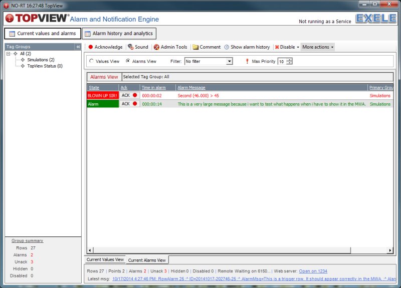
Since there’s less room to communicate information, deciding what is actually important and discarding the rest is essential. TopView on the desktop uses the concept of a row to communicate alarms and values. The mobile app still uses a row to show an alarm, and even has separate alarms and values views, but the row on the mobile app contains much less information. If you want to know more about an alarm, you can click on the row and see the row’s detailed information on a separate page.
Though there’s less on the alarms screen, what is shown carries greater weight. At first thought, less screen real-estate seems like a drawback, but it can provide more focus on what’s truly important and ease the information overload that can be prevalent on websites, given an intentional and well-thought out design.
When it comes to the notification of alarms, simple, actionable information is paramount. Not showing every detail for the alarm can be a helpful feature instead of something that holds the user back.
Other desktop idioms haven’t translated well to mobile devices. Hovering over something is common when you have a mouse pointer, but how do we translate hovering to a phone? A long tap is similar in concept, but requires the user to intentionally initiate it, instead of just happening like a hover. That’s not intuitive at all.
In TopView on the desktop, hovering over an alarm shows lots of information not in the main table: the alarm limits, notification settings, etc. In the MWA, we’ve chosen to navigate to another page when an alarm is tapped to show in-depth information about the alarm.
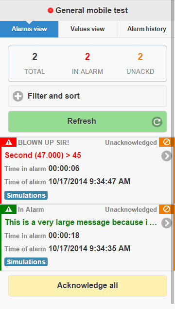
How we’ve chosen to show alarms on a smaller screen
As an added bonus, the app even works in a normal desktop browser. When shown on a bigger screen the app expands to use the available space a little differently, allowing for a little more breathing room instead of packing everything into a tight space when there’s a lot more real-estate available.
Not the whole story
The mobile web app has been designed primarily for use on a small screen, but it is still just a web application. That means that it’s easy to access using any web browser and we have to accommodate showing the app on a monitor as well.
To use larger spaces well, we created what’s known as a “responsive design”, which means that our app will respond to the size of the window that contains it.4
This allows someone to use the app on a larger screen without seeing a scrunched or strange elongated version of the app.
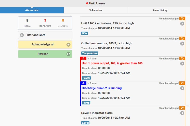
The MWA expands to fill available space
It seems simple to show the same information with more breathing room, but it wasn’t easy, we had to consider how the app would look at a variety of sizes and make sure that the app would look good at all of them!
Our foundation is shifting too
Since this application is built on top of modern web standards, we are dependent upon your web browser to behave the way we expect it to and the way browsers behave is in constant motion as well. New features are being added every day and old features are slowly being dropped, and each browser vendor has a different idea of the timeline for these changes! We find ourselves making hard choices each release about what versions to support. We want to push our product forward, but we don’t want to leave customers behind because they can’t use their browsers’ latest versions at work. Fortunately, mobile devices are usually able to update more frequently.
For example, a recent version of the MWA supported delivering and playing audible notifications on a mobile phone. All modern web browsers can support this behavior, but only Google Chrome can play the notification without forcing the user to tap the screen each time they want a notification played. Tapping the screen constantly to hear audible notifications wars with the very point of our use of the feature. Audible notifications allow the user to be free from staring at the screen the entire time.
It’s a challenge to bring new features to the application when not all the browsers can support it. Often, we must design the app to progressively add features where we can, making sure that everyone has access to the basic functionality of the app, but people using a current browser can access our newest features.
We’re part of an exciting era
It’s an exciting time to be using and creating software. It’s a field that moves fast, with new devices and new ways of thinking surfacing moment by moment. It’s fun for us to be building something in this environment, but we think it’s even more fun to realize how empowering these new applications that we can carry around with us in our pocket can be.
This project of ours is still new, and we still have a long way to go before we’ve settled on the best way to do things, but it’s already a versatile and powerful tool.
We had a lot of fun designing and building the TopView MWA and we hope that you find it empowers you to do a better job. If you have ideas about how it can be better, please let us know by emailing us.
Footnotes
1. Some things haven’t changed.↩
2. Computer science is still a young science, consider how long humanity has studied the stars. Algorithms and mechanical calculators began much earlier, but I think that computer science as we think of it today began in earnest in the 1800s. For more, I suggest taking a look at Wikipedia’s “History of computer science” article. Of course, computer science has its foundations in the study of mathematics, which is unquestionably much older. And we’re still catching up to ideas that have been around for long time. Bret Victor’s amazing talk, The Future of Programming, details how programmers are still working out ideas from the 60s.↩
3. Now that we have tablets with larger screens, we’re seeing resizable windows again.↩
4. Google has recently introduced “Material Design” which is their attempt at a Grand Unified Theory of design across all devices and sizes. It’s responsive design taken to another level. ↩